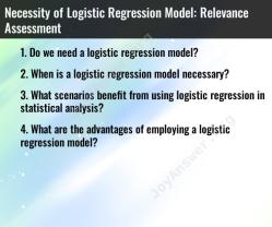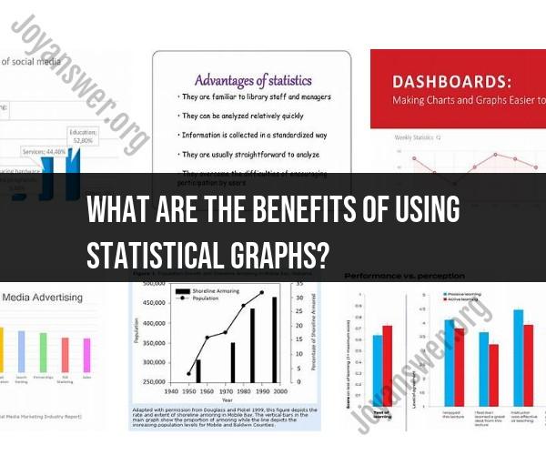
What are the benefits of using statistical graphs?
Using statistical graphs to represent data offers several benefits, including:
Clarity and Visualization: Statistical graphs provide a visual representation of data, making it easier for individuals to understand complex information. They can quickly grasp trends, patterns, and relationships in the data.
Simplifies Complex Data: Graphs can simplify large datasets, making it easier to identify outliers, trends, or unusual patterns that might be challenging to spot in raw data.
Comparison: Graphs allow for easy comparison between different data points, categories, or groups. This can be especially useful when analyzing the performance of various elements or making decisions based on comparisons.
Efficient Communication: When presenting data to others, graphs are more engaging and easier to interpret than tables of numbers. They enhance communication and help convey messages more effectively.
Identification of Trends: Graphs help in identifying trends over time, such as growth, decline, or cyclic patterns, which can be vital for forecasting and decision-making.
Highlighting Key Points: Graphs can be used to emphasize specific data points or trends, enabling users to focus on critical information without getting lost in the details.
Facilitates Decision-Making: Visual representations of data can aid in decision-making by providing insights into the consequences of different choices. They allow decision-makers to see the potential outcomes of various scenarios.
Universal Understanding: Many types of statistical graphs, such as bar charts, line graphs, and pie charts, are universally recognized and understood across different cultures and languages, making them a powerful tool for global communication.
Improved Data Exploration: Graphs encourage exploration of data by enabling users to interact with visualizations. This can involve zooming in on specific areas, panning across time periods, or toggling between different views.
Early Detection: Graphs can help in the early detection of anomalies or irregularities in data, which is crucial in fields like finance, healthcare, and quality control.
Enhanced Storytelling: Graphs can be used to tell a story or convey a message effectively. They make presentations, reports, and articles more engaging and persuasive.
Supports Hypothesis Testing: Statistical graphs are essential in scientific research and hypothesis testing, as they provide a visual basis for evaluating hypotheses and drawing conclusions.
In summary, statistical graphs offer a powerful means of representing data in a way that is accessible, informative, and conducive to analysis and decision-making. They play a fundamental role in data exploration, communication, and understanding across various domains.