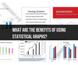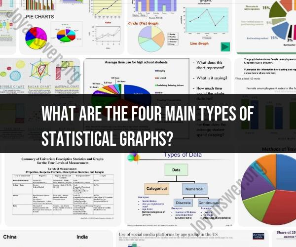
What are the four main types of statistical graphs?
There are several types of statistical graphs used to represent data, but four of the most common and fundamental types are:
Bar Graphs (Bar Charts):
- Description: Bar graphs use rectangular bars or columns to represent data. The length or height of each bar is proportional to the quantity it represents.
- Use: Bar graphs are effective for comparing discrete categories or groups of data. They are often used for displaying data that is not continuous, such as categorical data.
Line Graphs (Line Charts):
- Description: Line graphs use lines to connect data points, which are plotted at specific intervals on the graph. The lines show the relationship and trends between data points.
- Use: Line graphs are suitable for showing trends over time or when there is a logical order among the data points. They are commonly used for time-series data.
Pie Charts (Circle Graphs):
- Description: Pie charts use a circular shape to represent data, with segments (slices of the pie) representing different categories or proportions. Each segment's size is proportional to the quantity it represents.
- Use: Pie charts are used to represent parts of a whole and show the distribution of data into different categories or percentages of a total.
Histograms:
- Description: Histograms are similar to bar graphs but are used for displaying continuous data. They consist of contiguous vertical bars that represent the frequency or density of data within specific intervals (bins).
- Use: Histograms are used to visualize the distribution of continuous data and identify patterns, such as the shape of the data distribution, central tendency, and variability.
These four types of statistical graphs serve different purposes and are chosen based on the nature of the data and the specific insights you want to convey. Bar graphs and line graphs are suitable for discrete data and time-series data, respectively. Pie charts are ideal for showing proportions or parts of a whole, while histograms are used to depict the distribution of continuous data.