How do you create a frequency distribution?
Creating a frequency distribution is a data analysis technique that involves organizing and summarizing data into intervals or "bins" to show how often each value or range of values occurs in a dataset. Here are the steps to create a frequency distribution:
Step 1: Organize Your Data
Ensure your data is well-organized in a column in a spreadsheet or table. This column should contain the data values you want to create a frequency distribution for. For example, if you're working with a dataset of test scores, the first column could contain the scores.
Step 2: Determine the Number of Bins (Intervals)
Decide on the number of intervals or "bins" you want to use for your frequency distribution. Bins group similar data values together. The number of bins depends on the range of your data and your preference for granularity. Common methods to determine the number of bins include the Sturges formula, Scott's rule, or simply choosing a meaningful number based on your data.
Step 3: Create a List of Bin Edges
Next, you need to create a list of bin edges or cutoff points for each interval. These values will define the boundaries of each bin. You can do this manually or use software like Excel to help. Here's how to create bin edges:
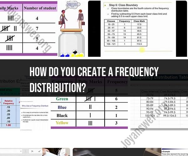
- In a separate column or area, list the bin edges. For example, if you're creating bins for test scores and want to group scores into intervals of 10 (e.g., 0-9, 10-19, 20-29, etc.), you would list 0, 10, 20, 30, and so on.
Step 4: Count Frequencies
Now, you'll count how many data values fall into each bin. This can be done manually or using software like Excel. Here's how to do it manually:
For each bin, count how many data values in your dataset fall within that bin's range. For example, if your first bin is 0-9, count how many data values are between 0 and 9 (inclusive).
Record the frequency count for each bin in a separate column or area next to the bin edges.
Step 5: Create a Frequency Table
To make the frequency distribution more readable, create a table that includes both the bin edges and the corresponding frequency counts. You can add labels to your columns for clarity.
Step 6: Visualize the Distribution (Optional)
If you want to visualize the frequency distribution, you can create a histogram using software like Excel:
Select the frequency counts and bin edge columns (including labels) to highlight the data.
Go to the charting or graphing options in your software and choose a histogram chart.
Customize the chart as needed, including adding labels and adjusting the intervals if necessary.
By following these steps, you can create a frequency distribution that helps you analyze and understand the distribution of your data, identify patterns, and gain insights into the frequency of different values or intervals within your dataset.
Creating a Frequency Distribution: Excel's Data Analysis Tool
To create a frequency distribution in Excel using the Data Analysis Tool, follow these steps:
- Enter your data in a column in Excel.
- Click on the Data tab and then click on the Data Analysis button.
- In the Data Analysis dialog box, select the Histogram option and click on the OK button.
- In the Histogram dialog box, select the Input range as the range of cells that contains your data.
- Select the Output range as the cell where you want the frequency distribution to be displayed.
- Click on the OK button.
Excel will create a frequency distribution table, which will show the number of times each value in your data set occurs.
Frequency Distribution Creation: Utilizing Excel's Features
Excel has a number of features that can be used to create frequency distributions. These features include:
- The FREQUENCY function: The FREQUENCY function returns the number of times a value occurs in a given range of cells.
- The Data Analysis Tool: The Data Analysis Tool can be used to create a histogram, which is a type of frequency distribution.
- The PivotTable feature: The PivotTable feature can be used to create a pivot table, which is a data visualization tool that can be used to summarize and analyze data, including frequency distributions.
Organizing Data with Frequency Distributions in Excel
Frequency distributions can be used to organize data in a number of ways. For example, you could use a frequency distribution to:
- Group data into categories. For example, you could use a frequency distribution to group sales data by product category or customer region.
- Identify trends. For example, you could use a frequency distribution to identify the most popular products or the most common customer support issues.
- Analyze data. For example, you could use a frequency distribution to analyze the performance of different marketing campaigns or the effectiveness of different customer support strategies.
Frequency distributions are a powerful tool for organizing data and identifying trends. By understanding how to use frequency distributions, you can improve your understanding of your data and make better decisions.
Here are some additional tips for using frequency distributions to organize data in Excel:
- You can use frequency distributions to create custom data sets. For example, you could use a frequency distribution to create a data set of the top 10 selling products or the most common customer support issues.
- You can use frequency distributions to create data visualizations. For example, you could use a frequency distribution to create a bar chart that shows the number of sales for each product category or a pie chart that shows the percentage of customer support tickets that are resolved within 24 hours.
- You can use frequency distributions to create pivot tables. Pivot tables are a powerful tool for analyzing data and identifying trends.
By understanding how to use frequency distributions, you can improve your data organization and analysis skills.