What is the percentage of normal curve?
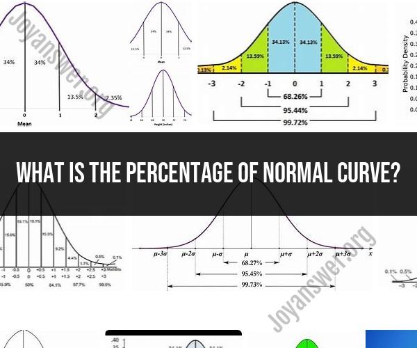
The normal curve, also known as the bell curve or Gaussian distribution, represents a continuous probability distribution. It extends infinitely in both directions and covers the entire range of real numbers. Therefore, it does not have a specific "percentage" associated with it in the way that discrete data might have percentages.
However, the concept of percentiles is often used in conjunction with the normal curve to describe the relative position of data points within the distribution. Percentiles represent the percentage of data points that fall below a particular value in a dataset when it is assumed to follow a normal distribution.
For example, the 50th percentile (also known as the median) represents the value below which 50% of the data points fall, and above which the other 50% fall. The 25th percentile represents the value below which 25% of the data points fall, and so on.
In a standard normal distribution (a specific type of normal distribution with a mean of 0 and a standard deviation of 1), you can find the values corresponding to specific percentiles using a standard normal distribution table or a statistical calculator. For instance, the 95th percentile corresponds to the value at which 95% of the data falls below.
It's important to note that the normal curve is continuous and doesn't have discrete percentages like a bar chart. Instead, percentiles are a way to describe how data is distributed along the curve, with values ranging from 0% to 100% representing different positions within the distribution.
Percentage of the Normal Curve: Interpreting Statistical Data
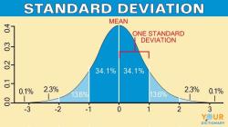
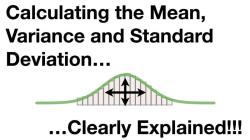
The normal curve, also known as the Gaussian distribution, is a bell-shaped curve that is used in statistics to describe the distribution of many naturally occurring phenomena. The normal curve is characterized by two parameters: the mean and the standard deviation. The mean is the average value of the data, and the standard deviation is a measure of how spread out the data is around the mean.
The percentage of the normal curve is a measure of how much of the data falls within a certain range. For example, we can say that 95% of the data falls within two standard deviations of the mean. This means that 2.5% of the data falls outside of the two standard deviation range.
We can use the normal curve to interpret statistical data in a number of ways. For example, we can use the normal curve to:
- Identify outliers: Outliers are data points that fall far outside of the normal range. By identifying outliers, we can better understand the distribution of the data and identify any potential problems with the data.
- Identify trends: The normal curve can be used to identify trends in the data, such as whether the data is increasing, decreasing, or remaining stable over time.
- Make predictions: The normal curve can be used to make predictions about the likelihood of a particular event occurring. For example, we can use the normal curve to predict the number of customers who will visit a store on a given day.
Grasping Percentiles on the Normal Curve: What They Signify
A percentile is a measure of how much of the data falls below a certain value. For example, if a student scores in the 90th percentile on a test, it means that they scored higher than 90% of the other students who took the test.
Percentiles can be used to compare different data sets and to identify outliers. For example, if we compare the percentiles of two different groups of students on a test, we can see which group performed better overall. We can also use percentiles to identify students who are struggling or who are excelling in a particular subject.
Normal Curve Percentages: Analyzing Data Distribution
The normal curve percentages can be used to analyze the distribution of data. For example, we can use the normal curve percentages to see how much of the data falls within a certain range or to identify outliers.
We can also use the normal curve percentages to make predictions about the likelihood of a particular event occurring. For example, we can use the normal curve percentages to predict the number of customers who will visit a store on a given day or the probability of a patient developing a particular disease.
The normal curve percentages are a powerful tool that can be used to gain insights into a wide variety of data sets. By understanding the normal curve percentages, we can better understand the world around us and make better decisions.
Here are some examples of how the normal curve percentages are used in real-world applications:
- Education: The normal curve percentages are used in education to compare the performance of different students and to identify students who are struggling or who are excelling in a particular subject.
- Business: The normal curve percentages are used in business to predict customer demand, to set sales goals, and to make investment decisions.
- Healthcare: The normal curve percentages are used in healthcare to diagnose diseases, to predict patient outcomes, and to develop new treatments.
The normal curve percentages are a versatile tool that can be used in a wide variety of fields. By understanding the normal curve percentages, we can better understand the world around us and make better decisions.