How do you construct a normal curve?
Constructing a normal curve, also known as a Gaussian curve or bell curve, involves creating a graphical representation of a normal distribution. A normal distribution is characterized by its bell-shaped curve and is defined by two parameters: the mean (μ) and the standard deviation (σ). Here are the steps to construct a normal curve graphically:
1. Determine the Mean and Standard Deviation: First, you need to know the mean (average) and the standard deviation of the data you want to represent with the normal curve. These parameters define the center and spread of the distribution.
2. Select a Range: Decide on a range or interval along the horizontal axis (x-axis) that covers the entire span of the distribution you want to represent. This range typically extends several standard deviations in both directions from the mean to capture most of the data.
3. Divide the Range: Divide the selected range into equal intervals or bins. The number of intervals you choose will depend on the level of detail you want in your curve. More intervals provide a finer representation.
4. Calculate the Probability Density: For each interval, calculate the probability density of the data falling within that interval. The probability density is calculated using the probability density function (PDF) of the normal distribution, which is given by the formula:
PDF(x) = (1 / (σ√(2π))) * e^(-((x-μ)^2 / (2σ^2)))
Where:
- x is the value within the interval.
- μ is the mean.
- σ is the standard deviation.
- π is the mathematical constant pi (approximately 3.14159).
- e is the mathematical constant approximately equal to 2.71828.
5. Plot the Points: For each interval, plot a point on the graph at the midpoint of the interval on the x-axis and the corresponding probability density on the y-axis. These points represent the probability density of the data within each interval.
6. Connect the Points: Connect the plotted points with a smooth curve. The resulting curve should be symmetrical and bell-shaped, with the highest point (peak) directly above the mean.
7. Label the Axes: Label the x-axis with the values or intervals, and label the y-axis with the probability density.
8. Add Mean and Standard Deviation Lines: Optionally, you can add vertical lines to the graph to indicate the mean (μ) and one or more standard deviations (σ) in both directions from the mean.
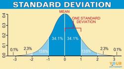
9. Shade Areas: You can also shade areas under the curve to represent probabilities or proportions of data falling within specific ranges. This is often done for specific percentiles or to illustrate the empirical rule (68-95-99.7 rule) for standard deviations.
By following these steps, you can create a graphical representation of a normal curve that accurately reflects the distribution of your data based on the mean and standard deviation. This curve is useful for visualizing the shape of a normal distribution and understanding the probabilities associated with different data values.
To construct a normal curve, follow these steps:
- Identify the mean and standard deviation of the data. The mean is the average value of the data, and the standard deviation is a measure of how spread out the data is around the mean.
- Draw a horizontal axis and label it with the values of the data. The mean should be in the center of the axis.
- Draw a vertical line through the mean. This line represents the normal curve.
- Draw two more vertical lines, one standard deviation to the left and right of the mean. These lines represent the two standard deviation range.
- Shade the area between the two standard deviation lines. This area represents the 95% of the data that falls within two standard deviations of the mean.
- Shade the remaining areas of the curve. These areas represent the 2.5% of the data that falls outside of the two standard deviation range.
Here is an example of how to construct a normal curve:
Suppose we have a data set of the heights of 100 people. The mean height is 170 cm and the standard deviation is 10 cm. To construct the normal curve, we would follow these steps:
- Draw a horizontal axis and label it with the values of the height data. The mean height (170 cm) should be in the center of the axis.
- Draw a vertical line through the mean height.
- Draw two more vertical lines, one standard deviation to the left (160 cm) and right (180 cm) of the mean height.
- Shade the area between the two standard deviation lines.
- Shade the remaining areas of the curve.
The resulting normal curve will show that 95% of the people have heights between 160 cm and 180 cm, and the remaining 5% of the people have heights outside of this range.
Normal curves can be constructed for any type of data, such as weights, test scores, or customer satisfaction ratings. By understanding how to construct normal curves, we can better understand the distribution of data and make better decisions.