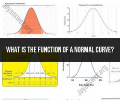
What does a normal quantile plot tell us?
A normal quantile plot, also known as a Q-Q (quantile-quantile) plot, is a graphical tool used in statistics to assess whether a dataset follows a normal distribution (bell-shaped curve). It compares the quantiles of your dataset against the quantiles of a theoretical normal distribution. Here's what a normal quantile plot can tell you and its significance:
Assessment of Normality: The primary purpose of a normal quantile plot is to determine whether your dataset approximates a normal distribution. In a perfectly normal distribution, the points on the Q-Q plot will form a straight line, typically a 45-degree diagonal line from the lower left to the upper right.
Departures from Normality: Deviations from the straight diagonal line suggest departures from normality. Specifically:
- If the points curve upward away from the line, it indicates that the data has heavier tails (i.e., more extreme values) than a normal distribution. This can suggest leptokurtosis (excess kurtosis).
- If the points curve downward away from the line, it suggests lighter tails (i.e., fewer extreme values) than a normal distribution, indicating platykurtosis (less kurtosis).
- If the points deviate from the line in other ways (e.g., bending at the ends), it may suggest skewness or other non-normal characteristics.
Outliers: Outliers in your dataset can also be identified on a normal quantile plot. Points that fall far from the expected diagonal line may represent extreme values or errors in the data.
Data Transformation: A normal quantile plot can help you assess whether a data transformation (e.g., log transformation) is needed to make your data more closely resemble a normal distribution. If the points exhibit a clear pattern of non-normality, transforming the data can be a useful preprocessing step.
Model Assumptions: In some statistical analyses, the assumption of normality is important. For example, in linear regression, it is often assumed that the residuals (the differences between observed and predicted values) follow a normal distribution. A normal quantile plot of residuals can help verify this assumption.
Model Selection: Normality assessments can influence the choice of statistical models. For instance, if your data does not follow a normal distribution, you may consider using non-parametric tests or alternative regression models.
In summary, a normal quantile plot provides visual insight into the distribution of your data. It helps you assess normality, identify departures from normality, detect outliers, and make informed decisions about data transformation or model selection. However, it's essential to remember that no dataset is perfectly normal, and small deviations from the straight line are common, especially with finite sample sizes. The interpretation of a Q-Q plot should be considered alongside other statistical analyses and domain-specific knowledge.
Understanding Data Distribution: Insights from a Normal Quantile Plot
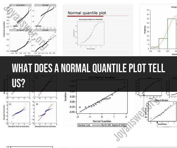
A normal quantile plot (Q-Q plot) is a graphical method for comparing two probability distributions. It is used to assess whether a data set is normally distributed.
To create a normal Q-Q plot, the data is first sorted in ascending order. The quantiles of the data are then plotted against the quantiles of a normal distribution. If the data is normally distributed, the points on the Q-Q plot will fall close to a straight line.
Quantitative Analysis: Interpreting Information from a Normal Quantile Plot
Here are some of the things that can be interpreted from a normal Q-Q plot:
- Normality: If the points on the Q-Q plot fall close to a straight line, then the data is likely normally distributed.
- Skewness: If the points on the Q-Q plot curve to the left, then the data is likely skewed to the left. If the points on the Q-Q plot curve to the right, then the data is likely skewed to the right.
- Outliers: If there are any points on the Q-Q plot that are far away from the line, then those points may be outliers.
The Graph of Normality: What a Normal Quantile Plot Reveals
A normal Q-Q plot can be used to reveal a variety of information about a data distribution. For example, it can be used to determine whether the data is normally distributed, skewed, or contains outliers.
Normal Q-Q plots are commonly used in a variety of fields, such as statistics, quality control, and engineering. They are a valuable tool for understanding and analyzing data distributions.
Here are some examples of how normal Q-Q plots can be used:
- A statistician might use a normal Q-Q plot to assess whether the data from a clinical trial is normally distributed. This is important because many statistical tests assume that the data is normally distributed.
- A quality control engineer might use a normal Q-Q plot to assess the quality of a product. For example, they might use a normal Q-Q plot to assess the weights of a batch of widgets.
- An engineer might use a normal Q-Q plot to assess the strength of a material. For example, they might use a normal Q-Q plot to assess the tensile strength of a batch of steel.
Overall, normal Q-Q plots are a valuable tool for understanding and analyzing data distributions. They can be used to determine whether the data is normally distributed, skewed, or contains outliers.