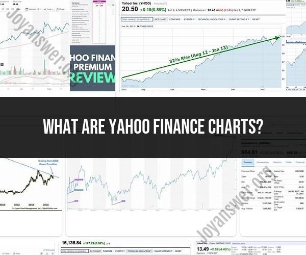
What are Yahoo Finance charts?
Yahoo Finance charts are interactive graphical representations of financial data that provide a visual way to analyze and track the performance of stocks, indices, commodities, currencies, and other financial instruments. These charts are widely used by investors, traders, and financial professionals to make informed decisions about buying or selling assets. Yahoo Finance offers various types of charts, including:
Line Charts: Line charts connect closing prices of a security over a specified period, creating a continuous line. They are useful for tracking trends.
Candlestick Charts: Candlestick charts show the open, close, high, and low prices for a specific period. They are excellent for identifying price patterns and market sentiment.
Bar Charts: Bar charts display price movements using vertical bars, with the top representing the high, the bottom representing the low, and a horizontal line on the left indicating the opening price.
Area Charts: Area charts are similar to line charts but fill the area under the line. They are useful for illustrating total returns over time.
OHLC Charts: OHLC stands for Open, High, Low, and Close. OHLC charts provide a visual representation of these four key price points within a specific time frame.
Volume Charts: Volume charts display trading volume for a security over time. They help identify trading activity and potential price reversals.
Yahoo Finance allows users to customize these charts by selecting different time frames (e.g., daily, weekly, monthly), adding technical indicators (e.g., moving averages, RSI), and drawing trendlines or annotations to perform technical analysis.
These charts are a valuable tool for investors and traders to visualize historical price data, identify trends, and make informed decisions in the financial markets.