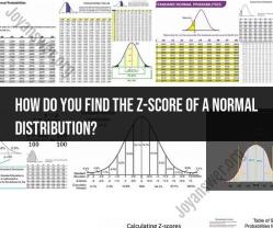
What is a z score chart?
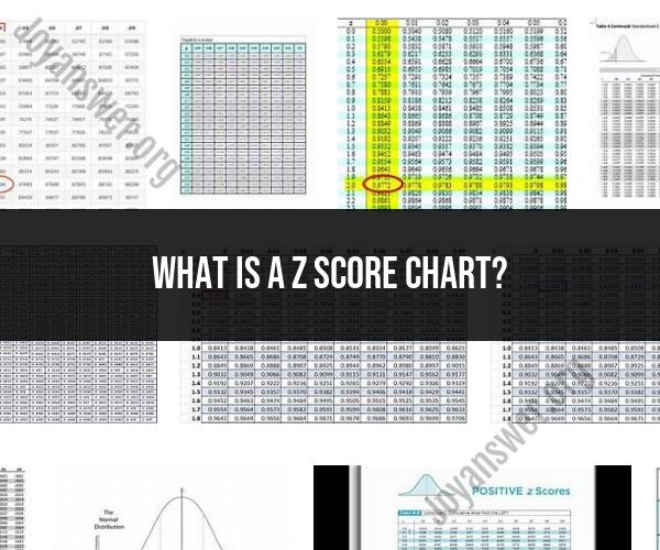
A Z-score chart, also known as a standard score chart, is a graphical representation used in statistics to visualize and understand the distribution of data in terms of standard deviations from the mean (average) of a dataset. It helps assess how individual data points compare to the overall distribution of the data and whether they are unusually high or low relative to the mean.
Here are the key components and uses of a Z-score chart:
Z-Score Calculation:
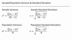
- To create a Z-score chart, you first need to calculate the Z-scores for each data point in your dataset. The Z-score of a data point (X) is calculated using the formula:
- Where:
- Z is the Z-score.
- X is the individual data point.
- μ is the mean (average) of the dataset.
- σ is the standard deviation of the dataset.
Plotting the Z-Scores:
- Once you have calculated the Z-scores for all data points, you can create a Z-score chart. Typically, this chart is a histogram or bar graph where the x-axis represents the Z-scores, and the y-axis represents the frequency or count of data points with each Z-score.
Understanding the Chart:
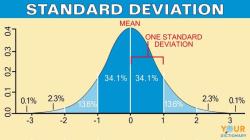
- The Z-score chart helps you visualize how data points are distributed relative to the mean of the dataset. A Z-score of 0 indicates a data point is exactly at the mean. Positive Z-scores indicate data points above the mean, while negative Z-scores indicate data points below the mean.
- The chart can show you the spread or dispersion of data and whether there are outliers (data points significantly far from the mean).
Identifying Outliers:
- In a Z-score chart, outliers are often defined as data points with Z-scores greater than a certain threshold, such as ±2 or ±3 standard deviations from the mean. These outliers may warrant further investigation as they can represent unusual or extreme values in the dataset.
Statistical Analysis:
- Z-score charts are commonly used in statistical analysis, quality control, and hypothesis testing. They provide insights into the normality and distribution of data and help identify data points that may require attention.
Quality Control:
- Z-score charts are frequently used in quality control processes to monitor the performance of manufacturing or production processes. Any data point with a Z-score outside a specified range may indicate a problem in the process.
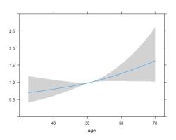
In summary, a Z-score chart is a visual representation of how individual data points in a dataset relate to the mean and standard deviation of that dataset. It is a valuable tool for understanding the distribution of data, identifying outliers, and making data-driven decisions in various fields, including statistics, finance, quality control, and research.