How do you graph a histogram?
Graphing a histogram involves several steps. Here's a step-by-step guide on how to create a histogram:
Step 1: Collect and Organize Data
First, gather the data you want to represent in the histogram. Make sure the data is numerical and can be organized into bins or intervals.
Step 2: Determine the Number of Bins
Decide on the number of bins (intervals) you want to use. The number of bins depends on the range of your data and the level of detail you want in your histogram. Common rules of thumb include the square root of the number of data points or the Sturges formula:
where is the number of bins and is the number of data points.
Step 3: Calculate Bin Width
Determine the width of each bin by dividing the range of your data by the number of bins:
Step 4: Create Bins
Divide your data into the chosen number of bins based on the calculated bin width. Each bin represents a range of values.
Step 5: Count Frequencies
Count the number of data points that fall into each bin. This is the frequency or count for each interval.
Step 6: Set Up Axes
On graph paper or in a graphing tool, label the x-axis with the bins and the y-axis with the frequency. Make sure the axes are appropriately scaled.
Step 7: Draw Bars
For each bin, draw a rectangle or bar whose height corresponds to the frequency of that bin. The bars should touch each other if the data is continuous.
Step 8: Title and Label
Provide a title for your histogram, and label the axes with appropriate units. This step is crucial for understanding the context of your data.
Step 9: Finalize
Review your histogram to ensure it accurately represents your data. Adjustments to bin width or the number of bins may be necessary for clarity.
Example:
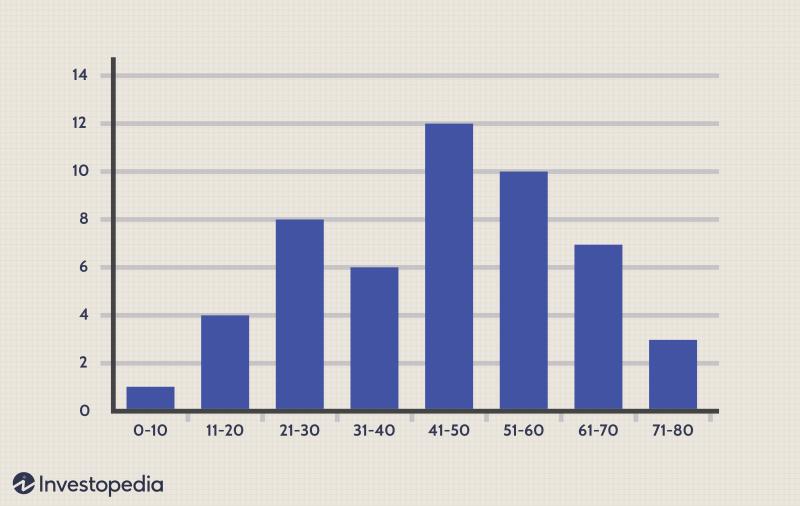
Let's say you have the following dataset representing test scores: 75, 82, 90, 88, 92, 78, 85, 92, 95, 88. Following the steps above, you can create a histogram representing the frequency distribution of these scores.
Remember, different software tools and graphing applications may have slightly different procedures, but the general principles outlined above apply to most histogram creation processes.
What are the essential steps to graphing data in the form of a histogram?
| Value | |
|---|---|
| -3.173 | 3 |
| -2.826 | 1 |
| -2.48 | 2 |
| -2.133 | 16 |
| -1.787 | 20 |
| -1.44 | 42 |
| -1.093 | 67 |
| -0.747 | 100 |
| -0.4 | 139 |
| -0.053 | 136 |
| 0.293 | 146 |
| 0.64 | 112 |
| 0.987 | 76 |
| 1.333 | 61 |
| 1.68 | 39 |
| 2.027 | 22 |
| 2.373 | 12 |
| 2.72 | 4 |
| 3.067 | 0 |
| 3.413 | 2 |