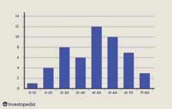
How to create a Histogram graph?
Creating a histogram graph involves several steps, and the exact process may vary depending on the software or tool you're using. Here's a general guide using software like Microsoft Excel:
Prepare Your Data:
- Organize the data you want to represent in the histogram. For instance, if you're representing ages, arrange the age data into groups or bins.
Open Excel and Input Data:
- Open a new Excel sheet and input your data into a column.
Create Bins or Intervals:
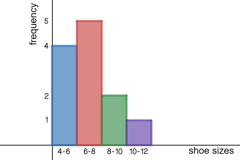
- Decide on the intervals or bins for your histogram. For age data, this might be groups like 20-30, 31-40, etc. You can create bins using Excel formulas or manually input the interval labels in a separate column.
Calculate Frequency or Counts:
- Use Excel functions like COUNTIF or FREQUENCY to calculate the frequency or count of data points falling within each interval.
Create the Histogram:
- Select the data (both the intervals and their respective frequencies).
- Go to the "Insert" tab and click on "Insert Statistic Chart" or "Insert Column Chart."
- Choose the option for a histogram or a clustered column chart, which will represent your data in histogram format.
Adjust the Chart:
- Once the chart is created, you might need to format it further:
- Adjust axis labels: Set the x-axis (horizontal) as the intervals and the y-axis (vertical) as the frequency or count.
- Modify chart title, axis titles, and legends for clarity.
- Customize colors, styles, and additional formatting as desired.
- Once the chart is created, you might need to format it further:
Finalize and Save:
- Review your histogram chart to ensure it accurately represents your data.
- Save the Excel file or export the chart as an image if needed.
Remember, the steps might slightly differ depending on the version of Excel or other software you're using. Additionally, software like Google Sheets, statistical packages (like R or SPSS), or dedicated data visualization tools often have specific functionalities to create histograms easily by guiding you through the process.
How can a Histogram graph be created using specific software or tools?
The process for creating a histogram graph can vary slightly depending on the specific software or tools you're using. However, the general steps are consistent across most platforms:
1. Prepare your data:
- Ensure your data is organized in a way that allows for easy binning. This often involves having two columns: one for the data points (e.g., heights) and another for their corresponding frequencies (e.g., number of students).
2. Choose your software or tool:
- Many software programs and online tools can generate histograms. Some popular options include:
- Spreadsheet software: Microsoft Excel, Google Sheets, LibreOffice Calc
- Statistical software: R, SAS, SPSS
- Online tools: GraphPad Prism, Plotly, Chart.js
- Programming languages: Python (matplotlib library), JavaScript (Chart.js library)
3. Access the histogram generation function:
- The specific steps to access this function depend on your chosen software. Refer to the software's documentation or help section for guidance.
4. Define your bin settings:
- Specify the range of values on the x-axis and the number of bins (bars) you want your histogram to have.
- You can choose to set the bin size manually or let the software automatically determine it.
5. Generate the histogram:
- Once you've defined your settings, the software will generate the histogram graph.
6. Customize your graph (optional):
- Most software allows you to customize the appearance of your histogram, such as adding labels, changing colors, and adjusting fonts.
Here are some additional details about using specific software:
- Excel: You can use the "Histogram" function or create a custom histogram using the "Chart" feature.
- Google Sheets: Use the "Explore" feature and select "Charts" to create a histogram.
- R: Use the "hist" function or the "ggplot2" package for more customization options.
- Python: Use the "matplotlib.pyplot.hist" function to create a histogram.
Remember to consult the software's documentation or online resources for specific instructions on how to create a histogram using that particular platform.