How to estimate standard deviation from a graph?
Estimating the standard deviation from a graph can be a useful skill, especially when you have data plotted as points on a graph but do not have access to the raw data. Standard deviation measures the dispersion or spread of data points from the mean (average). Here are some methods and tips for estimating the standard deviation from a graph:
Visual Inspection:
- Plot your data points on a graph.
- Identify the center or average value (mean) on the graph.
- Visually estimate how widely the data points are spread out around the mean.
Range Rule of Thumb:
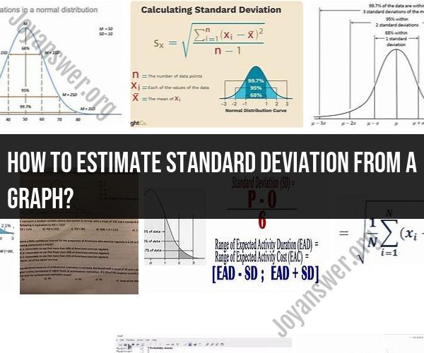
- A rough estimate of the standard deviation can be obtained using the "range rule of thumb," which suggests that approximately 68% of the data falls within one standard deviation of the mean, 95% within two standard deviations, and 99.7% within three standard deviations.
- Estimate the range of data that falls within one standard deviation above and below the mean. This range can be visually determined from the graph.
Count Data Points:
- Count the number of data points within one standard deviation above and below the mean.
- Use this count to estimate the proportion of data within one standard deviation.
Use Percentiles:
- If you have access to percentiles on the graph (e.g., quartiles), you can estimate the interquartile range (IQR), which represents the middle 50% of the data.
- Multiply the IQR by a scaling factor (approximately 0.67) to estimate the standard deviation, as about 68% of data falls within one standard deviation of the mean.
Reference Charts:
- Some reference charts and tables are available for common probability distributions like the normal distribution. You can use these charts to estimate the standard deviation based on the observed data distribution.
Digital Tools:
- If you have access to a digital version of the graph, you can use image analysis software to measure the distances between data points and the mean to estimate the standard deviation more accurately.
Be Aware of Assumptions:
- Keep in mind that estimating standard deviation from a graph is not as precise as calculating it from the raw data using statistical software.
- It assumes that the data follows a normal distribution or a similar distribution.
Practice:
- Estimating standard deviation from a graph becomes more accurate with practice. Try estimating it from various graphs with known standard deviations to improve your skills.
Remember that these methods provide rough estimates and may not be as accurate as calculating the standard deviation from raw data using statistical software. The accuracy of your estimate will depend on the clarity of the graph, the distribution of the data, and your estimation skills.
Estimating Standard Deviation from a Graph: Methods and Techniques
1. The Range Rule
The range rule is a quick and easy way to estimate the standard deviation of a dataset from a graph. To use the range rule, simply find the difference between the largest and smallest values in the dataset (the range), and then divide by four.
2. The Empirical Rule
The empirical rule, also known as the 68-95-99.7 rule, states that for a normally distributed dataset, approximately 68% of the data points will fall within one standard deviation of the mean, 95% of the data points will fall within two standard deviations of the mean, and 99.7% of the data points will fall within three standard deviations of the mean.
To use the empirical rule to estimate the standard deviation from a graph, first find the mean of the dataset. Then, draw two lines parallel to the x-axis, one standard deviation above and one standard deviation below the mean. Finally, count the number of data points that fall within these two lines. If approximately 68% of the data points fall within these lines, then your estimate of the standard deviation is accurate.
3. The Interquartile Range
The interquartile range (IQR) is a measure of the spread of a dataset that is less sensitive to outliers than the range. To calculate the IQR, first order the data points from smallest to largest. Then, find the median of the dataset (the middle value). The IQR is the difference between the third quartile (Q3) and the first quartile (Q1).
To estimate the standard deviation from the IQR, multiply the IQR by 1.349.
Visualizing Data: Using Graphs to Approximate Standard Deviation
There are a few different ways to visualize data using graphs that can help you to approximate the standard deviation.
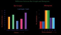
1. Histograms
Histograms are a type of bar chart that shows the distribution of a dataset. To create a histogram, first divide the range of the dataset into a number of intervals. Then, count the number of data points that fall into each interval. Finally, create a bar chart with one bar for each interval, with the height of each bar representing the number of data points in that interval.
The shape of a histogram can give you a good indication of the standard deviation of the dataset. If the histogram is symmetrical and bell-shaped, then the dataset is likely to be normally distributed and the standard deviation will be relatively small. If the histogram is skewed or has multiple peaks, then the dataset is not normally distributed and the standard deviation will be larger.
2. Boxplots
Boxplots are another type of graph that can be used to visualize the distribution of a dataset. Boxplots show the median, quartiles, and range of a dataset.
To create a boxplot, first draw a horizontal line to represent the median of the dataset. Then, draw a box around the middle 50% of the data points, with the bottom of the box representing the first quartile and the top of the box representing the third quartile. Finally, draw whiskers from the top and bottom of the box to the largest and smallest values in the dataset (excluding any outliers).
The length of the whiskers can give you a good indication of the standard deviation of the dataset. If the whiskers are short, then the standard deviation is relatively small. If the whiskers are long, then the standard deviation is larger.
Data Analysis: Estimating Standard Deviation from Graphical Representations
Once you have created a histogram or boxplot for your dataset, you can use it to estimate the standard deviation.
To estimate the standard deviation from a histogram:
- Identify the interval that contains the median of the dataset.
- Find the width of this interval.
- Divide the width of the interval by two.
- This is your estimate of the standard deviation.
To estimate the standard deviation from a boxplot:
- Find the length of the whisker on one side of the box.
- Multiply this length by 1.5.
- This is your estimate of the standard deviation.
It is important to note that these methods are only estimates of the standard deviation. To calculate the standard deviation exactly, you would need to use the formula below:
s = sqrt((sum of squares of deviations from the mean) / (n - 1))
where:
- s is the standard deviation
- n is the number of data points in the dataset
- sum of squares of deviations from the mean is the sum of the squared differences between each data point and the mean
However, the methods described above can be useful for approximating the standard deviation from