What is not to scale?
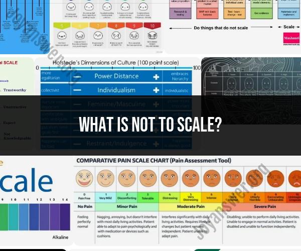
"Not to scale" concepts refer to representations that do not accurately reflect proportions or dimensions. This approach is often used in visual communication to emphasize certain aspects of an idea or convey a message beyond the literal measurements. Here are a few examples of how "not to scale" concepts can be explored:
Maps and Geography:Maps often use a non-proportional scale to highlight specific details. For instance, subway maps may distort distances to make navigation easier, or thematic maps might exaggerate certain features for emphasis.
Infographics and Data Visualization:"Not to scale" is commonly used in infographics to visually represent data relationships. Bar graphs or pie charts, for example, may have elements that are not proportional to the actual data values but are sized for clarity and visual impact.
Blueprints and Technical Drawings:Technical drawings sometimes use exaggerated scales to highlight intricate details that might be otherwise overlooked.
Educational Diagrams:Diagrams in textbooks or presentations may not adhere to scale to make concepts more comprehensible. For instance, illustrating the solar system's relative sizes on a single page wouldn't be feasible to scale.
Artistic Expression:Artists often manipulate proportions in their work for emotional or symbolic effect. Surrealists, for example, might distort the scale of objects to create dreamlike atmospheres.
Architectural Visualization:Models or visualizations of buildings or structures might distort scale to emphasize design elements or highlight specific features.
Logo Design:Logos often use creative liberties with proportions to create memorable and recognizable images that don't necessarily adhere to real-world dimensions.
Historical Representations:Depicting historical events or eras might involve non-proportional elements to highlight key features or emphasize certain aspects of the past.
Product Packaging:Packaging may use images that are not to scale to better display products or show their features prominently.
Children's Books and Media:In media targeted at children, objects might be exaggerated or simplified for easier recognition and engagement.
Editorial Cartoons:Cartoons use distortion and exaggeration to comment on current events or convey a message in a humorous or satirical way.
Advertising:Advertisements often employ "not to scale" elements to make products or offers more visually appealing.
In each of these cases, the goal is to communicate ideas effectively and engage the audience, even if it means sacrificing literal accuracy for conceptual clarity or visual impact. When working with "not to scale" concepts, it's important to ensure that the intended message is still effectively conveyed and that the distortion serves a purpose in the context of the communication.
