Home » Data Visualization » Matplotlib: Visualizing Data with Python

Matplotlib: Visualizing Data with Python

August 22, 2023 by JoyAnswer.org, Category : Data Visualization

What is matplotlib used for in Python? Embark on a journey of data visualization using Matplotlib in Python. Explore how Matplotlib empowers you to create interactive and informative graphs, charts, and plots to convey insights effectively.


Matplotlib: Visualizing Data with Python

What is matplotlib used for in Python?

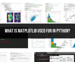
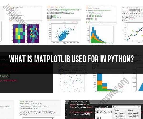
Matplotlib is a widely used Python library for creating static, animated, and interactive visualizations of data. It provides a flexible and comprehensive framework for creating a wide range of plots and charts to help you explore, analyze, and communicate your data effectively. Matplotlib is used for various purposes, including:

  1. Data Visualization: Matplotlib is primarily used for creating a wide range of static data visualizations, such as line plots, scatter plots, bar charts, histograms, pie charts, and more. These visualizations help in gaining insights into data patterns and trends.

  2. Scientific and Engineering Applications: Matplotlib is extensively used in scientific and engineering fields to visualize data related to experiments, simulations, and research. It's commonly employed in fields like physics, biology, astronomy, and engineering to create publication-quality plots.

  3. Statistical Analysis: Data analysts and statisticians use Matplotlib to visualize the results of statistical analyses. It allows them to create visual representations of distributions, correlations, and regression analyses, among others.

  4. Machine Learning and Data Science: Matplotlib is a valuable tool in machine learning and data science projects. It's often used to visualize datasets, model predictions, evaluation metrics, and decision boundaries.

  5. Customization: Matplotlib provides extensive customization options, allowing users to fine-tune the appearance of plots. You can control aspects such as colors, labels, titles, legends, axis scaling, and more.

  6. Interactivity: While Matplotlib is primarily known for static visualizations, it can be combined with other libraries like mpld3 or Bokeh to add interactivity to plots for web-based applications.

  7. Teaching and Education: Matplotlib is frequently used in educational settings to teach data visualization, scientific computing, and programming with Python. Its straightforward syntax makes it accessible to learners.

  8. Publication and Reporting: Researchers and professionals often use Matplotlib to create figures and plots for publications, reports, presentations, and data-driven storytelling.

Matplotlib's versatility, extensive documentation, and large user community make it a popular choice for data visualization tasks in Python. Additionally, it serves as the foundation for other libraries like Seaborn and pandas plotting, which build upon Matplotlib to simplify common data visualization tasks and create aesthetically pleasing plots with less code.

Tags Matplotlib Library , Data Visualization , Python Programming

People also ask

  • How can I graph an exponential function?

    You need to provide the points (t_1, y_1) (t1,y1) and (t_2, y_2) (t2,y2), and this calculator will estimate the appropriate exponential function and will provide its graph. Points to evaluate (Optional. Comma or space separated) =
    This step-by-step guide illustrates how to graph exponential functions efficiently. It covers the process of identifying key points, such as the y-intercept and asymptotes, and understanding how the growth or decay rate affects the curve. The article also discusses how to interpret the graph and extract valuable insights from it. ...Continue reading

  • What are the benefits of using a graph reflection calculator?

    A Reflection Calculator is an online calculator that is used to solve your Euclidean space problems involving point inversions. This calculator will provide you with the solved step-by-step solution for your line transformation associated with a point and its point reflection.
    Discover the benefits of using a graph reflection calculator. Explore how this tool can aid in visualizing and understanding geometric transformations, making complex graphing tasks more accessible and enhancing your mathematical proficiency. ...Continue reading

  • How to format numbers in SSRs?

    In this SSRS Formatting Numbers example, Select Sales Amount Textbox of the report, and Right-click on it will open the context menu. Please select the Text Box Properties.. option from it Once we click on the Text Box Properties.. option, a new Text box Properties window will open. Please select the Number tab .
    Discover the intricacies of formatting numbers in SQL Server Reporting Services (SSRs). Learn how to customize the appearance of numerical data in your reports to enhance readability and comprehension. ...Continue reading

The article link is https://joyanswer.org/matplotlib-visualizing-data-with-python, and reproduction or copying is strictly prohibited.