Master Line Graphs Effortlessly
Welcome to your interactive guide! We'll break down how to create a line graph step by step, making it easy and fun to visualize your data.
First, What IS a Line Graph?
A line graph is a chart used to show how something changes over a period of time. It connects a series of data points with a continuous line, making it perfect for spotting trends, patterns, and fluctuations.
For example, here's a graph showing how website visits changed over a week:
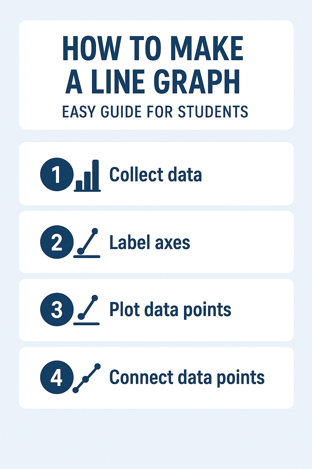
Interactive Workshop: Build a Graph!
Let's learn by doing. We'll use data on daily ice cream sales versus temperature. Follow the steps below to build the graph yourself.
Step 1: Get Your Data
First, you need data. Here's our sample data table. We want to see if higher temperatures lead to more sales.
Step 2: Label Your Axes
The horizontal line is the X-axis (independent variable) and the vertical line is the Y-axis (dependent variable). Type in the correct labels below.
Step 3: Plot & Connect
Now for the fun part! Click the buttons to see your data appear on the chart and then connect the dots to form the line.
Your Chart Will Appear Here
Best Practices for Great Graphs
A great graph is easy to understand. Use this checklist to make sure yours is clear and professional. Click each item to highlight it on the chart you just made!
- 1 Give it a clear, descriptive title.
- 2 Label the X-axis (including units).
- 3 Label the Y-axis (including units).
- 4 Ensure grid lines don't distract.
- 5 Make data points clear and visible.
Why Bother With a Line Graph?
Line graphs are popular for a reason! They have some key advantages that make them powerful tools for presenting data.
Spot Trends Instantly
The connecting line makes it incredibly easy to see if values are increasing, decreasing, or staying constant over time.
Compare Multiple Datasets
You can plot multiple lines on the same graph to easily compare the trends of different groups or categories.
Show Precise Values
Each data point is plotted exactly, allowing readers to see and understand the precise values you're working with.